
2.使用openpyxl 制作excel柱状图
1. 向sheet中写入数据
第一步,我们先向sheet中写入数据,第二步,再考虑如何制作柱状图,我准备了一份月收入数据
rows = [
    ('月份', '销售额'),
    (1, 30),
    (2, 40),
    (3, 50),
    (4, 55),
    (5, 57),
    (6, 60),
    (7, 65),
    (8, 50),
    (9, 50),
    (10, 45),
    (11, 40),
    (12, 35),
]
现在,创建一个excel并将上面的数据写入到月收入sheet中
from openpyxl import Workbook
from openpyxl.chart import BarChart, Series, Reference

wb = Workbook(write_only=True)
ws = wb.create_sheet('月收入')

rows = [
    ('月份', '销售额'),
    (1, 30),
    (2, 40),
    (3, 50),
    (4, 55),
    (5, 57),
    (6, 60),
    (7, 65),
    (8, 50),
    (9, 50),
    (10, 45),
    (11, 40),
    (12, 35),
]

for row in rows:
    ws.append(row)


wb.save("bar.xlsx")
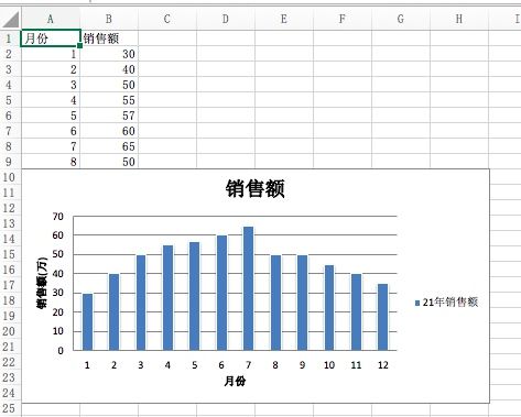
生成文件后,打开效果如下

2. 制作柱状图
for row in rows:
    ws.append(row)


chart1 = BarChart()
chart1.type = "col"
chart1.style = 10
chart1.title = "销售额"
chart1.y_axis.title = '销售额(万)'
chart1.x_axis.title = '月份'

data = Reference(ws, min_col=2, min_row=2, max_row=13)
cats = Reference(ws, min_col=1, min_row=2, max_row=13)
series = Series(data, title='21年销售额')
chart1.append(series)
chart1.set_categories(cats)

ws.add_chart(chart1, "A10")
wb.save("bar.xlsx")
我所绘制的是最简单的柱状图,type 设置为col, 绘制出来的就是垂直柱状图,如果设置bar,则是水平柱状图。
style 用来设置表格的风格样式,取值范围从1到48,openpyxl内置了48个风格样式供你选择。
data和cats分别设置数据集的范围和类别的范围,我们手工在Excel里作图也需要选定一个单元格区域,通过python写程序也是如此。在选定区域时,需要指定开始列和结束列,开始行和结束行。
在上面的代码里,我指定了开始行和结束行,指定了开始列,但没有指定结束列,因为各自都只有一列,不指定结束列也是可以的。
最后,通过add_chart将柱状图添加到指定的位置上,这里我选择的是A10单元格,最终呈现的效果如下
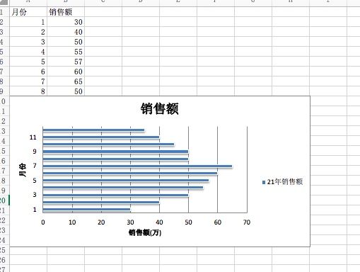
3. 水平柱状图
前面的柱状图是垂直的,通过修改type 的值为bar,可以得到水平的柱状图
chart1.type = "bar"
效果如下
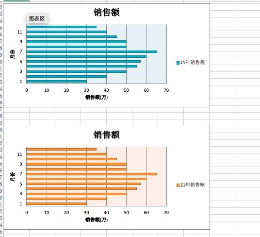
4. 不同的style
前面提到style一共有48种,官方文档上并没有一一列举这48中风格都是什么样子,我们可以自己一一实现查看效果
from openpyxl import Workbook
from copy import deepcopy
from openpyxl.chart import BarChart, Series, Reference

wb = Workbook(write_only=True)
ws = wb.create_sheet()

rows = [
    ('月份', '销售额'),
    (1, 30),
    (2, 40),
    (3, 50),
    (4, 55),
    (5, 57),
    (6, 60),
    (7, 65),
    (8, 50),
    (9, 50),
    (10, 45),
    (11, 40),
    (12, 35),
]


for row in rows:
    ws.append(row)


chart1 = BarChart()
chart1.type = "bar"
chart1.style = 1
chart1.title = "销售额"
chart1.y_axis.title = '销售额(万)'
chart1.x_axis.title = '月份'

data = Reference(ws, min_col=2, min_row=2, max_row=13)
cats = Reference(ws, min_col=1, min_row=2, max_row=13)
series = Series(data, title='21年销售额')
chart1.append(series)
chart1.set_categories(cats)


ws.add_chart(chart1, "A10")

for i in range(2, 49):
    chart = deepcopy(chart1)
    chart.style = i
    ws.add_chart(chart, "A"+str(10 + 18*i))

wb.save("bar.xlsx")
使用deepcopy复制出一个新的柱状图对象,随后修改它的style,就可以得到全部风格的柱状图,柱状图太多,我只复制其中两个的图片
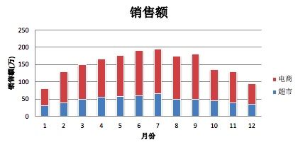
5. 堆叠柱状图
前面例子里的数据,不适合制作堆叠柱状图,我创建一个新的数据集
from openpyxl import Workbook
from copy import deepcopy
from openpyxl.chart import BarChart, Series, Reference

wb = Workbook(write_only=True)
ws = wb.create_sheet()

rows = [
    ('月份', '超市', '电商'),
    (1, 30, 50),
    (2, 40, 90),
    (3, 50, 100),
    (4, 55, 110),
    (5, 57, 120),
    (6, 60, 130),
    (7, 65, 130),
    (8, 50, 125),
    (9, 50, 130),
    (10, 45, 90),
    (11, 40, 90),
    (12, 35, 60),
]


for row in rows:
    ws.append(row)


chart1 = BarChart()
chart1.type = "col"
chart1.style = 10
chart1.title = "销售额"
chart1.y_axis.title = '销售额(万)'
chart1.x_axis.title = '月份'

data = Reference(ws, min_col=2,max_col=3, min_row=1, max_row=13)
cats = Reference(ws, min_col=1, min_row=2, max_row=13)
series = Series(data, title='21年销售额')
chart1.add_data(data, titles_from_data=True)
chart1.set_categories(cats)
chart1.grouping = "stacked"
chart1.overlap = 100

ws.add_chart(chart1, "A10")
wb.save("bar.xlsx")
想要得到堆叠柱状图,需要设置grouping属性为stacked,同时设置overlap的值为100。
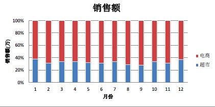
6. 百分比堆叠柱状图
想要得到百分比堆叠柱状图,需要设置grouping为percentStacked
chart1.grouping = "percentStacked"
7. 3D柱状图
制作3D柱状图,唯一的变化是引入BarChart3D代替BarChart,其他部分没有变化
from openpyxl import Workbook
from copy import deepcopy
from openpyxl.chart import BarChart3D, Series, Reference

wb = Workbook(write_only=True)
ws = wb.create_sheet()

rows = [
    ('月份', '超市', '电商'),
    (1, 30, 50),
    (2, 40, 90),
    (3, 50, 100),
    (4, 55, 110),
    (5, 57, 120),
    (6, 60, 130),
    (7, 65, 130),
    (8, 50, 125),
    (9, 50, 130),
    (10, 45, 90),
    (11, 40, 90),
    (12, 35, 60),
]


for row in rows:
    ws.append(row)


chart1 = BarChart3D()
chart1.type = "col"
chart1.style = 10
chart1.title = "销售额"
chart1.y_axis.title = '销售额(万)'
chart1.x_axis.title = '月份'

data = Reference(ws, min_col=2,max_col=3, min_row=1, max_row=13)
cats = Reference(ws, min_col=1, min_row=2, max_row=13)
series = Series(data, title='21年销售额')
chart1.add_data(data, titles_from_data=True)
chart1.set_categories(cats)

ws.add_chart(chart1, "A10")
wb.save("bar.xlsx")


扫描关注, 与我技术互动
QQ交流群: 211426309